
Color Your World with Paint: Part 1
This weeks segment is about "coloring your world using paint"! Painting your space, be it interior or exterior is a very inexpensive way to add vibrance to your home. And today we are going to talk about the following topics such as:
1. How color effects your mood.
2. Use color equal to the function in the space.
3. Natural lighting verses Artificial Lighting.
4. Guest: Tina Woods, Designer/Drafter & Landscape Designer
- Understanding different techniques.
HOW COLOR EFFECTS YOUR MOOD:
When it comes to your home, business or personal space, you most likely will desire color that appeals to who you are but did you know certain types of colors can also effect how you function in a space? Understanding how color effects your emotions will also help you choose the right color for the space whereas the task is performed. Your style (traditional, transitional, contemporary and modern) will also be a key component to selecting paint shades of color that correspond with other items in the space. Here are just a few examples of colors and the vibe they will portray when used properly verses overly used creating a negative effect. Your goal is to seek balance.
BLUE: Tranquility, Love, Trust Negative: Coldness and Fear
RED: Love, Energy, Passion Negative: Anger, Danger, Warning
GREEN: Money, Healing, Fertility Negative Envy, Jealousy, Guilt
YELLOW: Energy, Creativity, Happy Negative: Irresponsible, Unstable
ORANGE: Success, Friendliness Negative: Sluggish, Ignorance (jail)
PURPLE: Luxury, Spiritual, Ambition Negative: Mystery, Moodiness (niteclubs)
ACCENT COLORS:
TURQUOISE: Sophisticated, Healing Negative: Envy, Femininity
PINK: Healthy, Compassion, Playfull Negative: Weak, Immature
GOLD: Wealth, Prosperity
SILVER: Glamorous, High Tech
NEUTRAL COLORS:
BROWN: Conservative, Friendly, Outdoorsy Negative: Conservative, Dogmatic
TAN/BEIGE: Dependable, Conservative Negative: Dull, Boring
GREY: Security, Reliability Negative: Gloomy, Depressing
BLACK: Classy. Formal Negative: Death, Evil
WHITE: Fresh, Clean, Purity Negative: Emotionless, Boring
NOTE: Your goal is to seek balance. Using a neutral color for all over tone to the room is perfectly fine, but you would want to coordinate accent colors for added warmth. What not to do is color your space all in one shade (example Green) Green Walls, Green Furniture, Green Surfaces - (you might get sea sick).
Another important factor is your age. At certain periods in our life, are eyes begin to accept color differently. What color you may see vibrant in your younger years, may become intolerant in your elderly years. For example, have you ever noticed the senior centers always use alot of pastel shades. And what about signage, like banners or exit signs in public places.
USE COLOR EQUAL TO THE FUNCTION IN THE SPACE:
Ask yourself how will you function in this space. For example, in a space like a Kitchen, you will probably want a clean, fresh look with something vibrant - like Yellow or Orange - even Grey. This again could be neutral or accented walls & wall paper or used in accented florals, decorative items. Colors like Blue or Red, could be used in a bedroom to spice things up keeping it sexy!
NATURAL LIGHTING verses ARTIFICIAL LIGHTING:
In one of my previous shows (BLOGS), I spoke on topics of lighting which covered natural & artificial lighting as well as the light bulbs in fixtures. This is crucial to paint shades, because depending upon the lighting uses, can make your paint shade look completely different. In our next segment, I will talk more about the sheen and how it can also change the color from the paint swatch you might have selected.
As a designer, I always recommend to my clients to get a few quart size samples of the paint swatch they like, and paint a 3 ft x 3 ft square on the wall in different areas of the house before they purchase the paint. The color will also look different. It will also take different depending on the sub-strait applied to like plaster, wood, drywall, masonry.
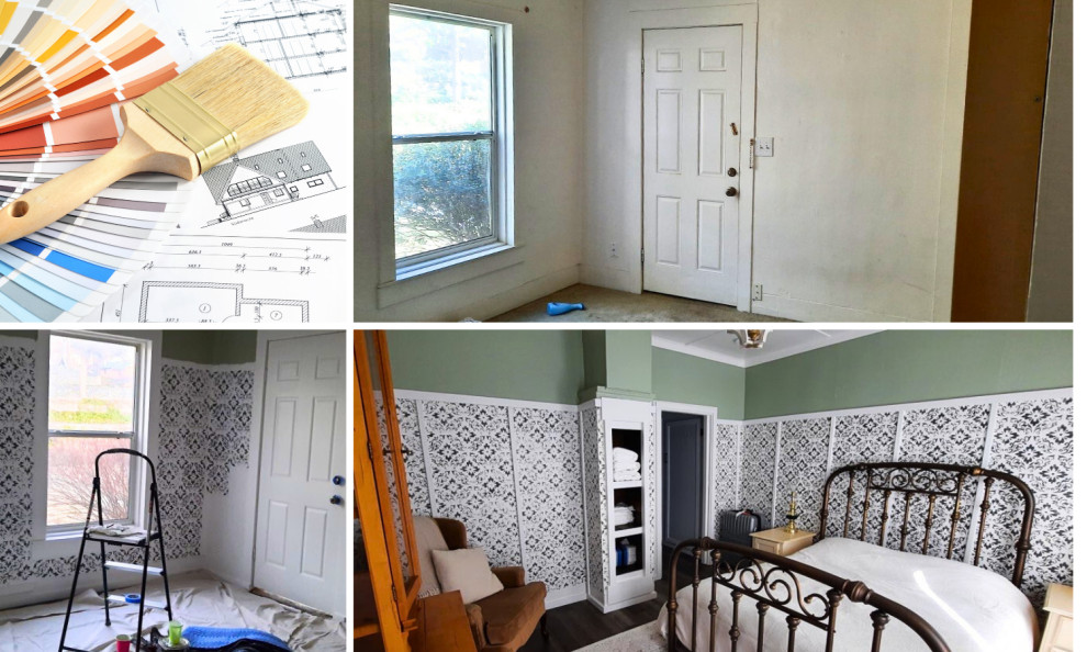
GUEST: Tina Woods
I met Tina while working as a Kitchen & Bath Design for a local showroom. She shared her story her background on building her own house, and her creative ability in design. She recently had a remodeling project, that was transformed into this country-chic style and absolutely adorable This is her story in her own words.
"As a designer I had the amazing opportunity to remodel a 120 year old house in a historical part of town her in Prescott, Arizona. I was on a shoestring budget and had to get really creative so that it looked expensive but really the cost was minimal.
In the bathroom all the warped and bubbled fibrous wall boards had to come down. All but the wall at the end of the bathroom got a new layer of bead-board. However, the end area of that space had existing vertical pine boards , which were surprisingly in great condition and I wanted to recondition them.
I painted the whole bathroom with Ovation latex paint in an eggshell finish. I purchased about 1 gallon of paint. The cost was about $20.00-25.00. I chose a light shade of pastel green because I felt it was calming for the room. I accente the trim in a semi-gloss Bright white - because it just looks fresh. Texture is very important to me, so when I studied the room, I asked myself how could I bring in some kind texture? And then it dawned on me to use a stencil. This is when I chose to use a raised stencil.
I wasn't really experienced on using stencils, so I went online and watched several tutorials on how to do this on furniture. I tried it on the wall and was really happy with how it looked. Then end result was really stunning.
THIS WAS MY TECHNIQUE... The secret is to buy multiple stencils , I bought 4 of the same stencils so Iwhen my stencil got to messy i would throw it in water and grab a clean one and keep going. I found my stencils at Joan’s Fabrics for 2.50 each, they
were on the smaller size as this is easier to handle. Use a large amount of joint
compound on the end of your scrapper and while holding the stencil against the
wall with one hand drag the scraper downward over the stencil with light
pressure so that the mud is level with the stencil, then carefully pull the
stencil off the wall…. And do it again. I wanted the raised stencil to stay white so I sealed them with Minwax fast drying polyurethane varnish, half pint $ 10.00-15.00".
For more information on how to contact Tina Woods for ideas,
please send us an email to: (click link)
DICDesignGroup@gmail.com and be sure to follow us on Facebook and Instagram @DICDesignGroup
NEXT WEEK: Color Your World with Paint: Part 2 - where will talk with a local professional painting company on understanding the paint process, how you as a consumer can prep & prepare and budget for your next paint project.
Informative Weblinks:
Psychology Today:
The Surprising Effect of Color on Your Mind and Mood | Psychology Today